Launch: Cancel Flow Design 2.0
Designed to make the best impression on your behalf and fit cleanly into your design stack.

Offering the subscription industry’s best cancel flow is continually our top priority, and that means creating an experience that's straightforward, intuitive, and enjoyable for your customers.
Because when we’re acting on your behalf, you’re entrusting us with your brand reputation and customer affinity.
That’s why I’m thrilled to introduce the next phase of our cancel flow experience. It’s designed to make the best impression on your behalf and fit cleanly into your design stack.
What’s new?
- A fresh, modern design is clean and inviting, adapting to your brand's style guidelines and personality with one click.
- New, smooth, dynamic animations propel customers forward through the flow, welcoming interaction.
- 🎉 Use the optional confetti animation to celebrate positive outcomes in a fun, human way.
Design Decisions
New Persistent Top Bar
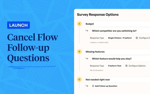
One major addition to the design is the presence of an “undercard” or “top bar.” This bar serves as a framing mechanism for every step of the cancel flow, presenting in plain language what your customer is seeing.
Examples


From our research, cancel flow steps written with clear framing—e.g. what this step is offering and why it’s being offered—received higher interaction rates and resulted, ultimately, in more feedback and better offer uptake. That’s why, with this new design, every step type is automatically categorized and micro branded for maximum effect.
Updated Typography
Version one of Churnkey’s Cancel Flow used Inter as the default font. For this version, I shifted the default selection to Helvetica Neue, which I think has more consistent spacing and is appealing to more brands. You can still, of course, override any layout decision with your own custom CSS—including the font stack.
One-Setting Customization
Churnkey’s Cancel Flow should always be a good citizen within your user interface and feel like it was something created by your product design team. That led me to two significant design decisions:
- Make brand customization require only one selection: your primary color. From there, the layout extrapolates secondary and tertiary colors throughout.
- Remove the option to upload your company’s logo. It’s rare for an internal customer-facing flow to include a logo, and this had a nice side effect of reducing customization overhead.
Remembering the Human
Animated transitions between flow steps, entrance, and exit make the new Cancel Flow seem snappy and more human.
Additionally, I felt that a special touch of interactivity—in the form of an optional confetti feature—was an important addition to help remind customers of their value and reward them for sticking around.
More to Come
Churnkey’s Cancel Flow is the most modern, adaptable, and easy to use in the subscription industry. It’s live in every account today.
And if you aren’t a Churnkey customer, start a free trial or book a meeting with us now.